Quiet the Noise – Listen to the Data
Below you will find a “temperature reading” on the market and the risk level on the “field.”
Relative Strength Line Up of the Asset Classes:
Q1 2016 Asset Scale Activity:
- Most activity in the Asset Scale since 2011
- Domestic Equities/Stocks fell from #1 to #3 and have moved back up for a 2nd place tie with CASH
- Commodities have moved up from last place to #5, the first move off bottom since June 2012, hence Gold’s impressive Q1 +16%

4/15/2016 Status:
- #1 Asset Class: Bonds/Fixed Income
- #2 Asset Class: Stocks/Domestic Equities
- Market Status: BULL MARKET
- NYSE Bullish Percent (NYSE BP): OFFENSE @ 61% Reversed up @ 27% on 2/1/2016.
What Contributed To the Market Performance Last Quarter:
A Dramatic Whipsaw in Equities Adds to Relative Strength Underperformance
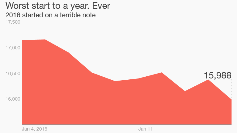
The quarter and the year began with the worst 10-day start to a year in the history of the Dow Jones Industrials dating back to 1897. Panic about the slowdown in China and crashing oil prices sent the Dow from above 17,200 to under 16,000.

To say the year got off to a rocky start would be a gross understatement. After the holidays ended and everyone returned to work, the stock market experienced a sharp selloff that left it in negative territory for January. The market would eventually bottom out in mid-February and continue to recover through the end of the quarter. Despite the early selloff, the S&P 500 actually finished up 0.77% for the quarter. Small Cap and International stocks were not immune to the sell-off as well, as both of those categories finished in negative territory for the first three months of the year. While most areas in the equity space rallied near the end of the quarter, it still wasn’t enough to push them out of the red. Fixed Income and interest rate sensitive securities were some of the best performing areas during the first quarter, with broad bond market indexes finishing up about 3%. Commodities, in general, also finished the quarter in negative territory, but put in a solid showing in the second half of the quarter, helping to stop the relentless slide they had been on since last year. All in all, while our allocations played our cards right; overweight bonds and cash underweight stocks and dipping our toe back into the commodity pool, the results were not overwhelming, as one would expect when you’ve followed the rules and the rules were right.
Looking at the summary numbers for the first quarter might have lead you to believe it was a ho-hum first three months of the year, but that was certainly not the case. We saw a tremendous amount of rotation under the surface. The overarching theme for our investing style was that the laggards finally had their day in the sun. Simply put, the stocks and asset classes that had been leading the market lower since last summer finally stopped going down and actually went up a lot from the lows. This is known as a laggard rally. These laggard rallies come along every so often and everyone realizes the leaders can’t lead forever so we view these periods as an opportunity to refresh the portfolios and find new leadership. More importantly, they don’t cause a change in our strategy. We can look to remove old leadership and our process tries to find the emerging leadership.
This past quarter, we saw a weakening dollar asset, and strength in Gold. For the first time since 2013, we find Gold back in our Models as of February. This position is a prime example of how and when we will lag the market, in the short-run, due to our tactical, NOT timing nature.
Despite Gold’s (GLD) robust performance in January and YTD given its longer-term weak performance since 2012 and its #6 position on the Asset Scale (having been there for almost 3 straight years), our rules required confirmation that we should own it. Confirmation in your terms means less whipsawing, which is almost always accompanied with short-term underperformance.
How so? February 8th, Commodities moved from the last position on the Asset Scale to #5, and on 2/12/16 we took a position in Gold which has been a flat trade thus far for our Models, yet GLD is up 15% YTD. That is frustrating to all, yes, but in honoring risk, AKA confirmation, we give up short-term performance. Gold will continue to be a safe haven and I suspect will continue add to the bottom line in 2016.
Why? The strong dollar had caused quite a headwind for assets such as international equities and commodities, which generally do better in a weak dollar environment. If the dollar continues to weaken, we expect to see more of these types of assets come into our models as their performance improves visa vie other asset classes that have benefited from the strong dollar. That would actually be a welcome change as it would allow our strategies to do what they do best: find bull markets anywhere around the globe (and in places many people are overlooking).
On the individual equity side, it was much the same as the asset class side. The so-called FANG’s (Facebook, Amazon, Netflix, and Google) were stellar performers last year, but had a difficult start to the year. What really performed well were the things like energy and basic materials that had such dreadful performance last year. One example of this is when we look at the S&P 500 industry groups. The worst relative strength groups outperformed the best performing group by more than 12% during the first quarter! That was completely opposite from last year when just avoiding the worst groups was the key to outperformance. Whether these groups can continue to perform is anyone’s guess, but often times they have a large rally off the bottom and then settle in as average performers while they work out their issues.
Every investment strategy, whether it’s value investing, growth investing, or trend following goes through periods of underperformance, and relative strength (RS) is no exception. Periods where RS lags can be uncomfortable times in the market, and the recent market activity is an unfriendly reminder of this. The latter part of 2015 into the beginning of 2016 has been a great example of when we typically see these types of market environments. Certainly, one of the times that RS will experience underperformance is off of a market bottom, and another environment would be times of leadership change.
A Relative Strength Market Bottom Study:
At the risk of another lengthy chart-chocked and data filled newsletter, I wanted to share this RS study from Dorsey Wright and Associates. It delves into our last market bottom example of 2009 and attempts to explain WHY we should hold tight with a RS strategy.
Relative Strength Laggard Period Perspective, DW&A 3/31/2016
The 2009 market bottom, and initial rally, was the epitome of an RS laggard period for stocks. In general, the stocks that performed the worst heading into the market bottom were the stocks that rebounded the quickest off the market bottom.
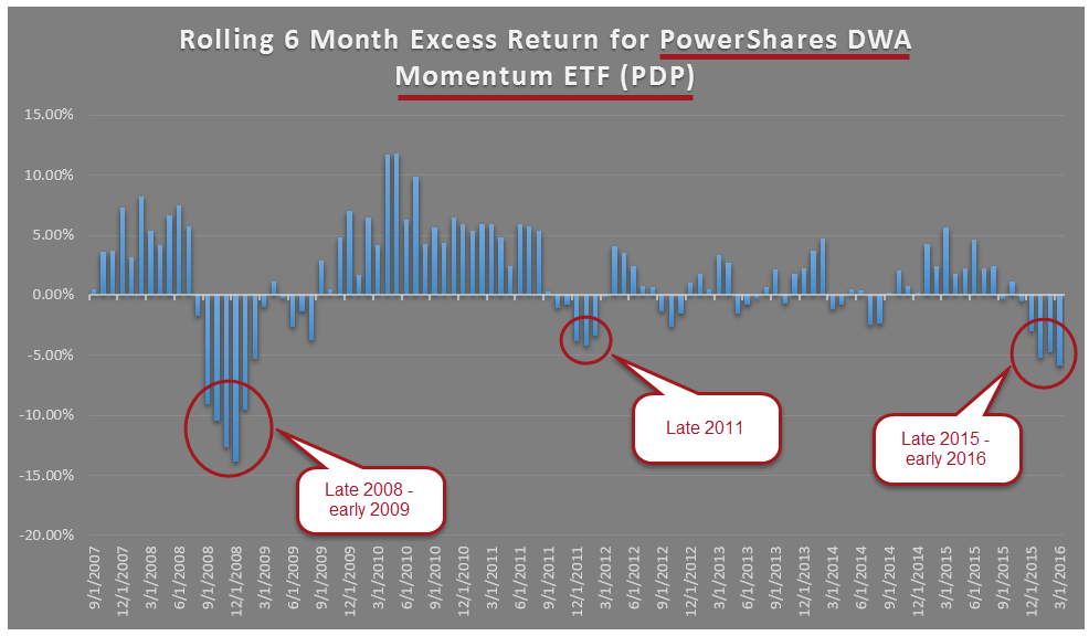
In order to get a sense of RS laggard periods over the past eight plus years, we looked at the rolling six month excess returns of the PowerShares DWA Momentum Portfolio PDP versus the S&P 500 Index SPX. PDP is an ETF based on the DWA Technical Leaders Index which owns 100 of the top RS stocks, and rebalances and reconstitutes quarterly. This ETF provides a good gauge of how a basket of high RS stocks are doing and has a live trading history going back to March 2007. This recent “trend” in underperformance in RS stocks is the worst that we have seen since the late 2008 / early 2009 time period based on rolling six month excess returns. While periods of underperformance like this are not common, they are not unprecedented. And, as difficult as they feel, periods of underperformance are sometimes the best times to add to these types of strategies because these are often the times when the strategies are adapting to the new leadership trends in the marketplace. Notice, for instance, coming out of the 2009 time period, PDP displayed positive excess rolling six month returns for nearly two years from November 2009 through August 2011.

The returns used above are not inclusive of dividends or all transaction costs. Investors cannot invest directly in an index. Indexes have no fees. The relative strength strategy is not a guarantee. There may be times where all investments are unfavorable and depreciate in value. Past performance is not indicative of future results. Potential for profits is accompanied by possibility of loss.
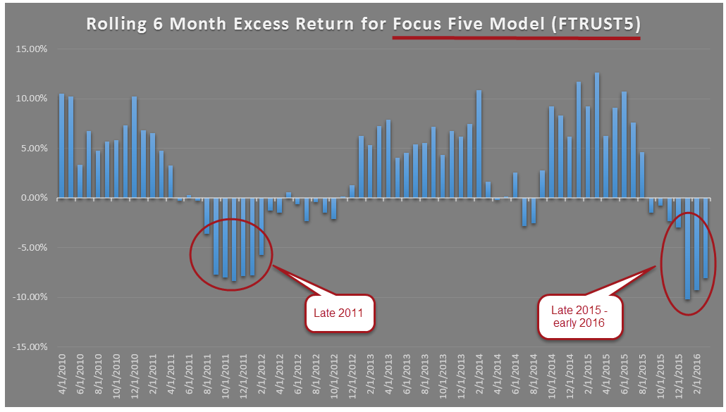
Another strategy is sector rotation. One way to track RS sector rotation is with the Focus Five Sector Rotation Model, which owns five of the top RS sectors within the First Trust lineup for sectors. This Model was first published in late-October 2009, and a similar analysis based on rolling six-month excess returns versus the S&P 500 Index SPX shows an interesting story, and also shows the recent underperformance we have all been feeling in RS-based strategies. Since the end of October 2009, there were 72 rolling six-month periods examined in the chart below. Out of these 72 periods, 46 have resulted in positive excess returns over that six-month period. For instance, the data point on the chart below at 12/31/2014 would represent the excess return over the six-month period of 6/30/2014 thru 12/31/2014. So, another way of stating the above would be to say that every month money is allocated to this strategy there has been a 64% probably of excess return of the next six months. The reality about RS strategies, though, is that the numbers don’t necessarily work out that cleanly.
The resulting “trend” in rolling excess returns has been negative, the worst stretch this Model has seen since 2011, and this comes on the heels of a year and a half of positive excess return periods. That is the bad news. The good news is that many of the same reasons for the underperformance in 2011 are the same reasons for underperformance in recent times, and the biggest reason would be turnover. Since the history of the Model (10/21/2009 – 3/30/2016) there have been nine changes in holdings. Out of those nine changes, five of those changes came in 2011 and four of those came from June 1st thru December 31st. In other words, in the six and half years of live model trades more than half came in 2011. Second only to 2011 is the year of 2016 in terms of model turnover, as 2016 has seen two changes in holdings in just the first three months. Outside of 2011, this is the only year the Model has actually experienced multiple changes in one year.
So, while market bottoms can present RS laggard periods (like 2009), market environments that see a lot of turnover also present periods of underperformance. This occurs as the old leadership rotates out of favor (like Healthcare, for example) and the new leadership trends emerge (like Utilities and Energy). There is no doubt this recent performance has been uncomfortable, and while not common it is not unprecedented. These bouts of underperformance often present great opportunities as the new leadership trends rise to the top.

The returns used above represent model returns and are not inclusive of dividends or all transaction costs. Investors cannot invest directly in an index, like the S&P 500 Index. Indexes have no fees. Model performance data does not represent the impact material economic and market factors might have on an investment advisor’s decision making process if the advisor were actually managing client money. The relative strength strategy is not a guarantee. There may be times where all investments are unfavorable and depreciate in value. Past performance is not indicative of future results. Potential for profits is accompanied by possibility of loss.
Bottom Line:
Major Index YTD Performance thru 3/31/2016:

Q2 Outlook – What’s In Store?
Portfolio Changes:
One of my favorite sayings is “Performance measured is performance improved.” I am constantly tuning our strategies, rules and models and measuring past performance in order to bring optimal risk-adjusted performance to our clients. After almost 3 years of due diligence, I will be increasing the number of Models that Darrin Cohen and his team at Infinite Asset Management (IAM) manages for us, in-house at Folio.
Currently, IAM manages 7 of our 20 Models. IAM not only adds an extra layer of money management expertise, but also represents a way to diversify our 100% Pure RS strategy. As you’ve read above, there are benefits to a pure RS strategy, but over a market cycle, opportunities exist for alternate strategies to outperform — and hence, compliment a RS approach. IAM does employ RS, but also incorporates alternate tactical strategies beyond my expertise. This is a strategic partnership worth mentioning and that we are excited about.
Furthermore, IAM brings a host of alternative options for our portfolios such as private equity and multi-strategy hedge fund options.
New additions to the Q1 line-up:
A Utilities Model was added late January to several allocations resulting in YTD performance of +6.68%. For those clients who don’t own the Utilities Model, never fear, you own RYU, the IShares Utilities ETF within your AV Core Model. RYU is up nearly 12% since we added it to all portfolios.
Albeit Healthcare is having a bit of a comeback from its Q1 selloff, we cut our allocation to Healthcare in half in account and moved half to the abve mentioned Utilities Model. Healthcare has moved considerably down the RS performance scale, but we remain in the space, in a limited manner, and in some portfolios we are void.
Resources, Resources, Resources!
Check out our Resources page at Alphavest.com and explore the many ways in which we are empowering investors.
A Snapshot of What’s There:
Morningstar™ Fee Analysis. Learn just how much you pay each year in fees and help others to educate themselves on what they pay too! Did you know that excessive fees can amount to upwards of 21% of your wealth over a 20-30 year period? We are committed to offering the lowest fees possible and want all of our clients to know what they are paying.
Free Consultations with Cokie. Those who have used this offer have found it beneficial and have been pleased with the value 15 minutes of their time provides. We use this resource to offer investors a no-pressure opportunity to assess whether Alphavest is a good fit. This is a great place to send those that you think may need our services. Thank you for your referrals and consideration!
FINRA Advisor Background check. FINRA reports that only a small percentage of investors check their advisor’s record before making a switch. We run background checks on our employees, our childcare providers — why not run one, it’s FREE — on the person who manages your money? Rest assured our record is spotless (click here for Cokie’s U4). The important feature of the report is that it will indicate “NO DISCLOSURES,” which means no fraud or investor complaints.
Subscribe to Cokie’s Blog:
 Most of my blogs are less than 200 words (except our quarterly newsletter) — short and sweet! I post as a means of quick and efficient communication with you, my clients. Your feedback is very important to me. THANK YOU for letting me know what you like reading… and what you don’t!
Recent blogs from Q1:
- Three Ways the 2016 Election Can Affect My Investments
- Green Beer and Green-Light from Yellen; Stock Hangover Ahead?
Join the Liberated Investor Movement Today!
We launched the Liberated Investor Movement in an effort to educate investors on how to break free from being held hostage by “Big Brokerage.”
The Liberated Investor Tool Kit exposes five areas of the investment management industry where the deck is stacked against investors and offers simple and direct advice:
- Excessive Fees and What Can Be Done About Them
- The Myth of Buy and Hold
- The Emotion Behind Market Timing
- Industry Conflicts of Interest
- How to Hire An Advisor That’s On Your Side
Download the Tool Kit today and share with your Facebook community and friends and family!
The best way to refer us? Tell others to download the FREE The Liberated Investor Tool Kit:
