
As mentioned in our Q3 Newsletter posted mid July, the #2 spot on the Asset Scale, International equities, took back’s it spot from Bonds/Fixed Income for the mid-April after yet another flip-flip of positions, following the same from mid-December 2014.
As you may recall, Bonds dethroned International from the #2 spot, mid-December 2014, after an almost 2 year reign in the #2 position. Friday, Bonds/Fixed Income, regained its #2 spot on the Asset Scale. Quite precarious as the world anticipates rate hikes from the Fed later this year. While the Bond market isn’t showing an anticipated September rate hike, all investors somewhat expect it. For us, we will move as the indicators tell us and remove the emotion from our investment decision making.
So what now? Are we adding significant bond positions to accounts and selling all international equities?
NO, NO , NO.
As we get further confirmation of the widening of the gap between the #2 and #3 Asset Scale positions, we would look to decrease our International exposure to as little as 10% in some models/accounts, while adding exposure, slowing to more bonds.
Our diversified International focus, as of today—which, as you know, changes quickly, includes the following regions/countries:
- Developed and Emerging European regions
- European Small caps
- International Healthcare
- International Consumer Discretionary
Thankfully, our Relative Strength Matrix modeling exited us from China and Emerging Asia prior to those markets major corrections.
Contact us if you have any questions! Just remember: We’ve got you managed.
As always, thank you for your feedback as we try to keep you updated on the market and your investment portfolios.

P.S. To follow is a very technical, yet informative piece I wanted to pass along from Dorsey Wright and Associate’s (DWA) Monday Equity report.
While I encourage all to read the report—DON’T get bogged down in the technical lingo that might not make sense to you. INSTEAD let your take away be the methodical way in which DWA guides us in our decision making; data, logic, rules guided by RISK indicators to help us steer you clear of major market events. I am very cautious and taking great measures to decrease risk and volatility in your portfolios, yet there is no cause for alarm right now.
Dorsey Wright & Associates
Daily Equity Report
July 27, 2015
Defensive Preparedness: Watch for These Key Signs
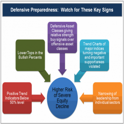
With the increasing market volatility over the past few weeks, we have received several requests for an update on our 5-pronged “Game Plan for Defensive Preparedness.” We introduced this recipe of 5 key market indicators to help determine the level of defense with which you should be running your portfolios. Today, we will walk you through an updated look of each of these 5 indicators, from both a Domestic and International equity perspective, to determine what is the best game plan moving forward for portfolio management in the current environment. The goal of this exercise is to offer you a template to use to evaluate the risk of a more severe equity market decline, whether it comes three months or three years from now.
The image below offers a succinct pictorial of the suggested Game Plan. At first glance, you can see that the evaluation process involves both Trend and Leadership indicators and measurements. That said, we will now look closely at each key point and how things stack up today. And what you will find upon conclusion, is that the equity picture, both Domestic and International, is at an interesting inflection point, as we are beginning to see more of the 5 signs turn or stay negative, such as lower tops on the bullish percent charts, sector narrowness, but from a long term perspective, both on an absolute and relative basis (trends, DALI, PTNYSE), the weight of the evidence in favor of US equities still remains positive. Of course, it is imperative to vigilantly evaluate these indicators discussed below on a consistent basis, to understand if the overriding bullish theme has changed.
1. Positive Trend Indicators Below 50% Level:
Trend analysis is one of the cornerstones of our research at DWA. Simply put, the only way over time a stock or index can remain in an overall uptrend is by showing higher prices; and as an investor, this is how you are remunerated — by higher prices. It is thus important that you focus your investing on those stocks that are trading in an overall positive trend. This is an easier task when the market is strong and healthy, as there are naturally more stocks trading in overall positive trends. When that number declines, it usually is indicative of a more difficult market. We can apply the “bullish percent concept” to measure and evaluate the number of stocks in an overall positive trend (above their respective bullish support lines), and refer to such indicators as Percent Positive Trend Charts.
By definition, the Percent Positive Trend indicators measure the % of stocks within a given universe that are trading in a positive trend. This number is plotted on a scale of 0 to 100%. From our studies (and common logic), we’ve found the market is considered “healthy” when the Percent Positive Trend indicators are at 50% or greater. Generally speaking, the market tends to suffer during times when the PT reading(s) are below 50%. Simply put, as the PT readings fall, it suggests more and more stocks are moving into an overall negative trend, which can only be accomplished through lower prices. It is for this reason, that we constantly watch the PT charts to see how they are faring, in order to keep a bead on how individual names are trending.
Domestic Equities & International Equities:
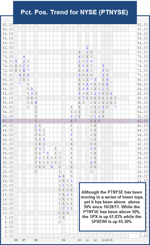
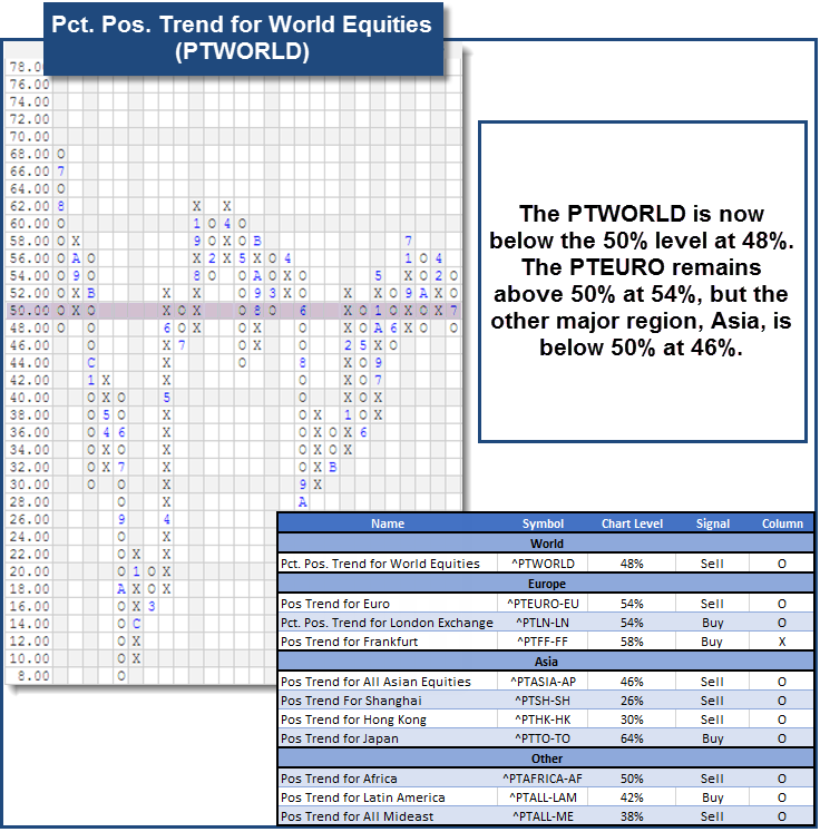
Today, both the US and world PT indicators are in Os and have experienced declining chart levels, as more stocks have fallen into negative trends. While the PTNYSE remains above the important 50% threshold, it is in Os and has fallen to the 56% level, indicating that just over half the stocks on the NYSE are trading in positive trends. In the US all of the major PT indicators, such as the PTOPTI or PTALL, are above the 50% level, but the World PT (PTWORLD) recently dropped below the 50% threshold and is currently located at 48% on its chart. At this juncture the trend picture for the individual stocks in the US that make up “the market” are still tipped toward the bullish camp, but when it comes to the International equity asset class, the PT indicators are tilted towards a more negative posture.
2. Lower Tops in the Bullish Percents:
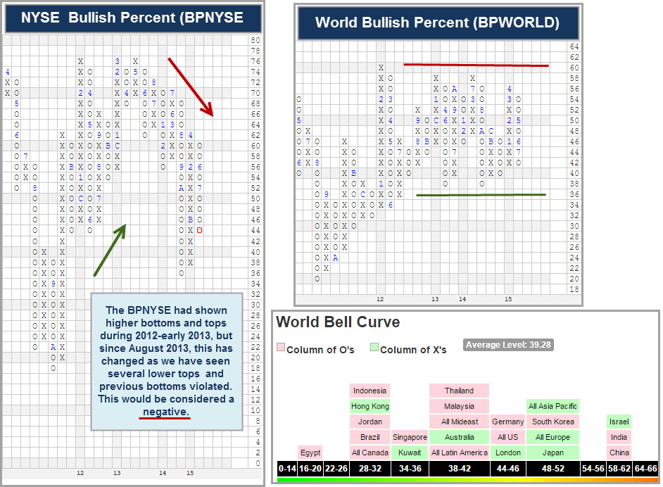
Domestic Equities: Another sign to watch for, to indicate a deteriorating market, is whether or not the market Bullish Percent’s are showing lower tops. The Bullish Percent indicators are “participation” measurements, and strictly speaking they measure the % of stocks within a given universe that are on a PnF Buy Signal. Of course, the most popular and longstanding at Dorsey, Wright is the venerable NYSE Bullish Percent BPNYSE. But of course, we follow bullish percents on all the major market universes, including International Equities, along with all the sectors. For example, a few worth also evaluating on a regular basis would include: Optionable Universe Bullish Percent BPOPTI, Small Cap Bullish Percent BPSCAP, Mid Cap Bullish Percent BPMCAP, and Large Cap Bullish Percent BPLCAP, among others. From a shorter term perspective, we evaluate whether the BPNYSE (and others) are in a column of X’s — on Offense, or in O’s dictating Defense. But from a more structural basis, we will evaluate whether the BPNYSE is showing a series of lower tops. If so, it suggests more and more soldiers are leaving the field, and basically fewer and fewer are participating in any market rally back up.
When we look at how things stacked up as we went into 2008, for example, we noticed the BPNYSE was showing a series of lower tops, and had been since its peak in early 2004. This was evidence that as the market rallied, even to new highs in October 2007, it was doing so with less and less participation. In short, the participating leadership was getting narrower and narrower; in a nutshell, narrow leadership is not the sign of a broadly healthy market.
As we look at where things stand today, we find that the market bullish percent’s had been showing higher bottoms and generally higher tops from October 2011 through roughly mid-2013, but over the past two years we have seen this change. More specifically, as seen in the image below, the BPNYSE has now broken three straight (previous) bottoms — first in June 2013, another in February 2014, and the third bottom was broken in September 2014 (after making a second lower top — all while the market had moved to new highs last September). We have then seen yet another lower top made this April after reversing down just in June – and the S&P 500 Index SPX just moved to new all-time highs in July (yet with fewer “soldiers” participating). Overall, it is important though to look at other market BP’s to see if similar action is occurring in other universes — such as in Small Cap, or Nasdaq, etc. At this point, basically all of our market bullish percent’s are in a column of O’s – on Defense, and in many cases (but not all) have broken previous bottoms after showing lower tops. This is one “mark” against the longer term bullish outlook.
International Equities: Just as we have numerous Bullish Percent’s to help evaluate participation in the Domestic Equity market, we similarly have BP’s for International Equities. One that we particularly look at for broad perspective is the World Bullish Percent BPWORLD. This includes all stocks in our entire equity universe, across all countries including the United States. We show a glimpse of BPWORLD below. Notice that it really has been stuck in a range for a couple of years now, between roughly 38% and 58%. It really hasn’t been showing either higher tops and bottoms, or lower tops and lower bottoms. This would suggest that over the past couple of years there have been both bullish areas and bearish locations at different times. That said, BPWORLD is in a column of O’s at this time, and is therefore on Defense. Another way to gain more in-depth insight across the globe is by consulting the World (Bullish Percent) Bell Curve. This allows you to see specific regions of strength and weakness, i.e. which countries are on Offense, and which are on Defense, and their respective field position.
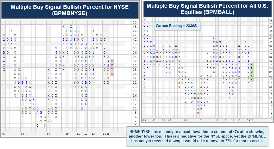
For added confirmation in a heightened risk scenario, you can turn to the Multiple Buy Signal Bullish Percent for NYSE BPMBNYSE as a supplement to the BPNYSE guidance. The BPMBNYSE measures the % of stocks within the NYSE universe that have produced at least two consecutive PnF buy signals. Because of the nature of this indicator, which tends to reduce the “noise” of choppy chart patterns, it is slower to change course and thus less frequent in its changes. In a similar fashion to BPNYSE, lower tops on the BPMBNYSE suggests fewer participants in the market and a more defensive scenario, especially if it coincides with lower bottoms. In 2008 that condition existed, as the BPMBNYSE topped in May 2007 at the 46% level, then began its descent lower, accompanied by a series of lower tops.
Today’s picture is starting to look dicey, too. The BPMBNYSE reversed down in February 2014 to make a lower top and break a previous bottom. We just recently saw BPMBNYSE reverse down to show yet another lower top as less stocks within the NYSE are able to stay on multiple buy signals, with only about a quarter of them doing so. Similar to the BPNYSE, we would now have to rate this indicator as bearish, or a “mark” against the overall bullish outlook, as fewer stocks are now able to string together two or more buy signals; this also speaks to a market that is more volatile with swings and potentially less consistent with its follow-through to the upside. (Note that we keep Multiple Buy Bullish Percents for All Stocks BPMBALL and the Optionable Universe BPMBOPTI, too.) To that end, BPMBALL is also shown below, and notice that it has not yet reversed down into a column of O’s, yet will do so at 22%. The “All” universe includes all U.S. stocks that we track.
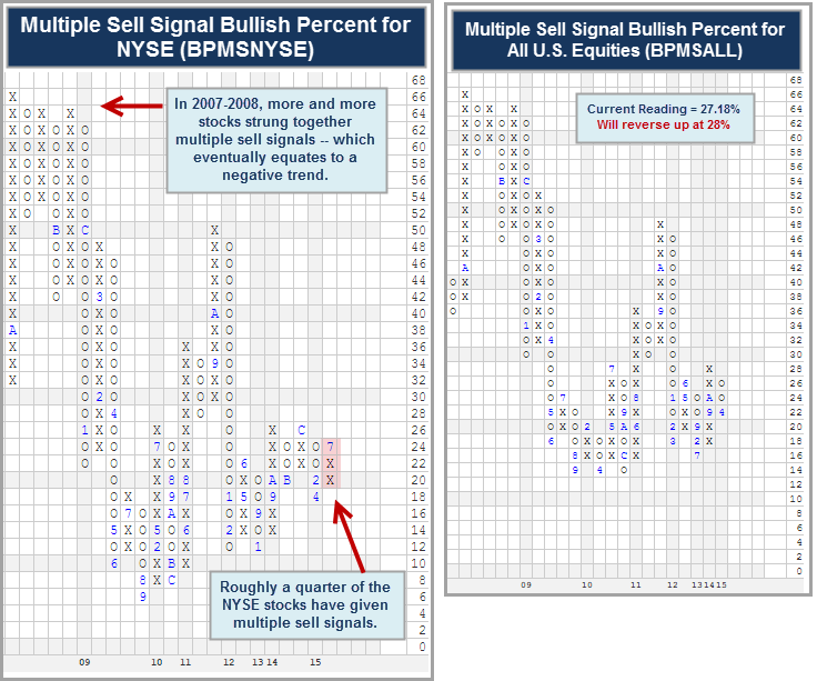
Yet another bullish percent indicator to consult, which acts basically as a mirror-opposite to the Multiple Buy Signal, is the Multiple Sell Signal Bullish Percent for the NYSE BPMSNYSE, or another given universe. When looking at BPMSNYSE, it becomes a great concern if it is in a column of X’s moving higher, and is showing a series of higher tops and higher bottoms. Think about it — if this indicator is moving higher, it suggests more and more stocks are stringing together multiple sell signals; and that basically is how a trend starts to shift from positive to negative. Back in 2007-2008, more and more stocks strung together multiple sell signals — and this eventually equated into stocks shifting to negative trends, and a subsequent deterioration in the Positive Trend indicators. For example, the BPMSNYSE moved from a reading of 8% in February 2007 to an ultimate peak at 66% by late 2008.
The good news, when we fast-forward to today, is that the BPMSNYSE is at 25.77%, therefore only a quarter of the stocks have given multiple sell signals – but the bad news is that this indicator has reversed up into a column of X’s and is therefore moving higher. The All Stocks Multiple Sell Signal Bullish Percent BPMSALLthough is still in a column of O’s, at 27.18%, but is close to reversing up and will do so at 28%. Of course, we are watching closely to see if another notable rise in the number of stocks giving multiple sell signals occurs, as it would be evidence toward a potential shift in the collective trend of the market.
3. Defensive Asset Classes giving Relative Strength Buy Signals Over Offensive Asset Classes:
To determine the overall strength of a particular area of the market or asset class, we turn to DALI, which provides us with a tactical guide based a ranking of the major asset classes on a relative strength basis.When monitoring the market for deterioration or weakness, we typically find defensive asset classes giving relative strength buy signals over offensive asset classes. These defensive asset classes are lower beta and lower ‘risk’, such as Money Market, Fixed Income, as well as Foreign Currencies. Offensive asset classes are normally defined as US Equities, International Equities, and Commodities. One can identify these types of changes through basic RS charts between a defensive and offensive asset, or by using DALI.
One reason we compare defensive versus offensive asset classes is due to the fact that it can be quite helpful in determining the type of environment we are in and what type of exposure we need to have going forward. For example, when looking back to 2008, the relative strength comparison between the S&P 500 SPX versus the Barclays Aggregate Bond Index AGG favored the more defensive asset classes, as Fixed Income, AGG, gave a sell signal, suggesting a tilt towards more defensive assets, like Fixed Income. A month later, if you were to look at the DALI ranking, it would have favored the defensive asset classes over US and International Equities. Commodities were in second place, but Foreign Currency was in first while Cash and Fixed Income ranked above US and International Equities, as those two areas continued to lose RS buy signals. Today, we continue to see equities, both Domestic and International, in general, remain on buy signals versus defensive assets, like Fixed Income. We have, however, witnessed some shifting dynamics that are worth noting.
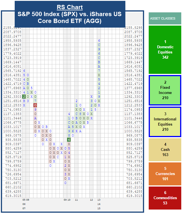
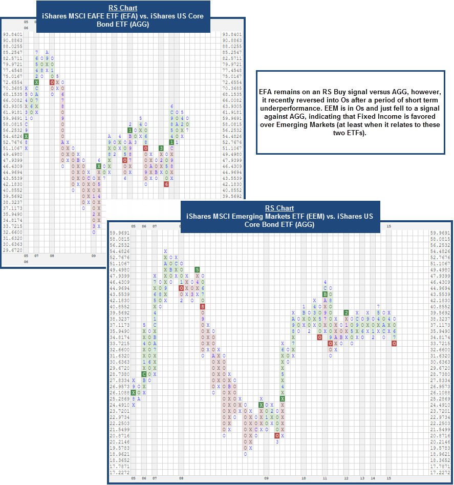
First, while US equity remains in first place in the DALI Tally Ranking, we have seen International equity lose some buy signals, causing it to move to a tied position with Fixed Income. When we drill down to see how International stacks up, one on one, versus Fixed Income, we have also witnessed some areas, like Emerging Markets, give up their buy signal versus Fixed Income. To shed some more light on this, we have compared US equity, Developed Markets, and Emerging Markets to Fixed Income. US equity, using the S&P 500 SPX as its proxy, is on a buy signal and in Xs versus the iShares US Core Bond ETF AGG, which serves as a proxy for Fixed Income. This is an indication that US equities are still favored against the more defensive Fixed Income asset class. Developed Markets are on a buy signal versus Fixed Income, yet with the recent volatility in the International markets, we have seen it reverse down into Os, suggesting near term underperformance. Emerging Markets, on the other hand, have seen the most deterioration versus Fixed Income, as this area is now in Os and on a sell signal, which was given on July 8, versus Fixed Income. Overall, US equity is winning the battle against more defensive asset classes, but International equities are losing ground, which is evident on the DALI Tally Ranking as well as some of the RS charts between International equities and defensive asset classes.
4. Trend Charts of Major Indices Turning Negative and Important Support Areas Violated:
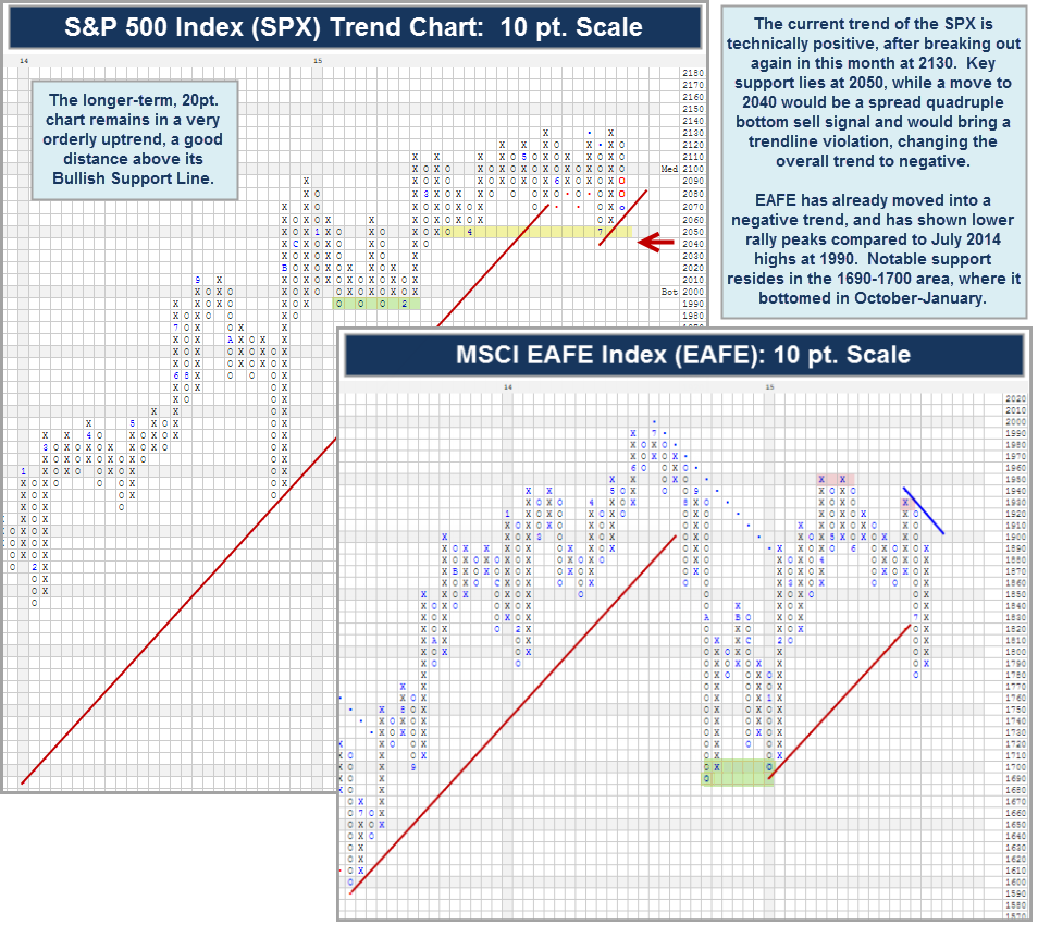
Domestic Equities: When looking for further evidence of deterioration in the equity market, we also turn to the trend charts of major indices. If the trends of these important indices turn negative along with other violations of key support levels, then it suggests a deteriorating market. Looking back at 2008, the long term trend of the SPX turned negative after it violated its bullish support line in January, shifting the posture of this index to a more defensive one. As well, it coincided with trend changes across most of the major indices. Currently, the long term trend of the S&P 500 SPX is technically positive (although we had a negative trend break in late June, yet managed to go back to a positive trend this month). The key level of initial support is 2050 on the 10 point per box chart; yet a move to 2040 would be a big negative as that would result in a spread quadruple bottom sell signal, violating this support built up over the past few months, and would bring a violation of the bullish support line, thereby changing the overall trend to negative. The next support from there would be the 1990 level, from January-February. It is worth noting that the SPX remains in an orderly, bullish trend on its longer-term 20 point per box chart. In other words, it is worth consulting other scales to gain perspective on the market, as to where long term support and resistance reside. At this juncture, we have seen other market indices move to negative trends on their default charts, but not necessarily on their longer term charts. We of course, will be keeping a close eye on the SPX, and other indices to see if further (negative) trend changes occur. One way to keep track of this type of change is through the ‘Set Activity Alert’ function, which allows you to set email alerts for any technical events, such as changes in trend. For now, there are some signs of weakness on a trend basis, but not pervasively yet.
International Equities: When we look across the pond, though, the trend picture is not as rosy. For example, in analyzing the broad-scope MSCI EAFE IndexEAFE, shown below, we find that the overall trend (on the 10 point scale) is negative. We have been seeing lower tops since hitting resistance in April-May at 1950, which was below the highs seen in June-July 2014 at 1990. Notable support resides at 1690-1700, which is where EAFE bottomed in October-January. So this trend picture is a negative for the International Equity picture, broadly speaking. But realize it is worth analyzing specific country or region index charts to verify the trend picture.
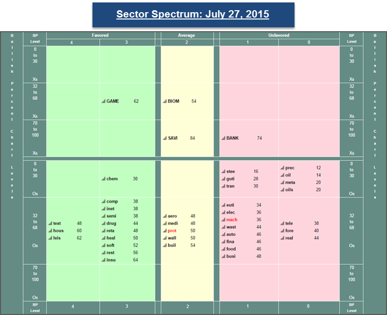
5. Narrowing of Leadership from Individual Sectors (and Countries):
Domestic Equities: We often find that market tops take time to form, but another way to identify signs of weakness can be done on the sector level, as these sectors serve as microcosms of the broader, macro market. So far in 2015, we have seen the number of sector favored grow from 8 at the beginning of the year to 14 today. Before the recent volatility in July, the number of sectors enjoying favored status had grown to 18, so some of the market choppiness has caused some sectors to lose their favored status. Thus, there has been some slight narrowing of leadership, but it is worth noting the sectors that have fallen from favored status. At the end of June, Media, Transports/Non Air, Oil, and Oil Service all were favored sectors. Fast-forward to today, 3 of those 4 sectors are now unfavored, while Media has fallen to average status. The reason we mention these sectors is the fact that these 4 sectors spent short periods of time in favored status and that they also have underperformed the S&P 500 SPX. Also, the decrease in favored sectors is not alarming, especially after the market pullback that investors went through during the first part of July. At this point, we have seen some slight narrowing of leadership, but we are nowhere near the levels that were seen during early 2008 and August 2011, at 8 sectors and 3 sectors that were favored, respectively. Also, since last featuring these five points back in September of 2014, the number of favored sectors has increased from 6 to the current reading of 14, and at the time of the market correction during October 2014, the number of sectors that were favored was 3. So while we see less than half the sectors in a favored status and have seen some narrowing in leadership, it’s not as bad as previous periods in the market that suggested more defensive action.
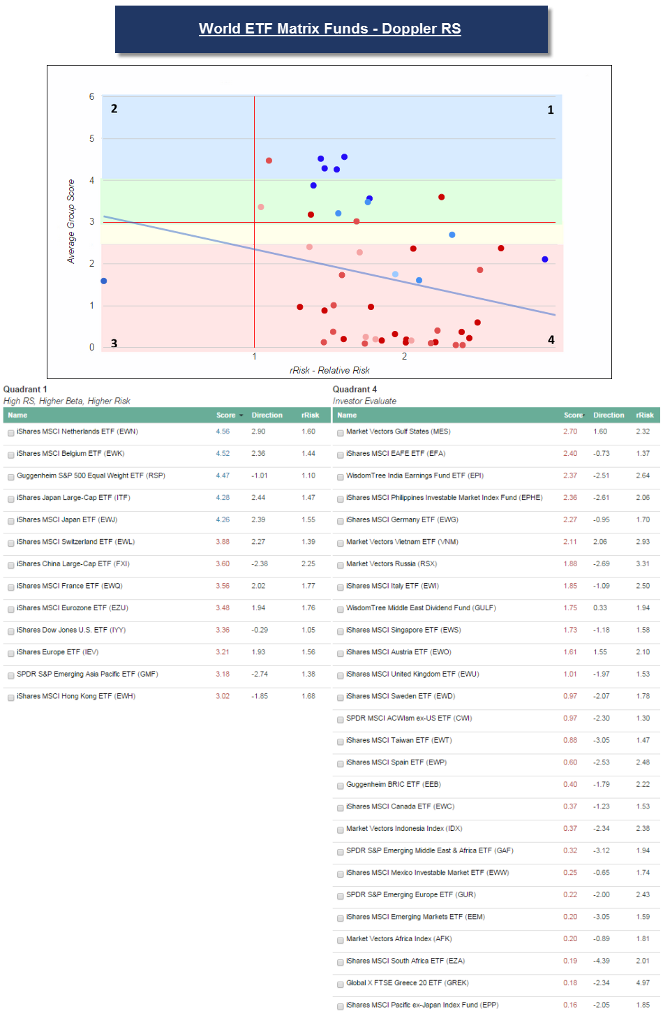
International Equities: Like US equities, there has also been a narrowing of leadership in the International equity asset class. While we turn to sectors to get an idea of market breadth in the US, we often turn to countries to get an idea of how narrow or wide the strength is in the International marketplace. To view market breadth abroad, we recommend examining country ETFs and their respective scores, which tell you how strong or weak a particular fund (or in this case, a country) is at the present time. In the graphic below, we have taken the ETFs on the pre-made World ETF Matrix and plotted them on a scatter plot, using the DWA Quadrant Analysis. The tool plots the funds based on their scores, rRisk, and a third element – score direction. The more positive the score directions, the darker the blue, and the more negative the score direction, the darker the red. Out of the country ETFs on the World ETF Matrix, there are only eight single country ETFs (excluding US and regional) that are scoring above 3. To put this in perspective, on July 27, 2005, or ten years ago, when International equity was one of the top asset classes in DALI, 19 out of the 23 single country ETFs (which we had score data for) were scoring above 3. So today, we are faced with narrowing leadership in the International markets, even with International equity still battling it out for second place in DALI. There is one positive though – the strong are getting stronger. While the leadership is narrow, most of the countries that are considered leaders are seeing improving scores (funds highlighted in blue), so continue sticking with strength when allocating abroad.
While we make every effort to be free of errors in this report, it contains data obtained from other sources. We believe these sources to be reliable, but we cannot guarantee their accuracy. Investors who use options should read the Options Disclosure Document before making any particular investment decision. Officers or employees of this firm may now or in the future have a position in the stocks mentioned in this report. Dorsey, Wright is a Registered Investment Advisor with the U.S. Securities & Exchange Commission. Copies of Form ADV Part II are available upon request.